Designing a new airline mobile application from scratch
Client
Role
Responsibilities
Skills and techniques
Tools
Time frame
Project
Fly UX is a project for my Professional Diploma in UX Design at Glasgow Caledonian University, through The UX Design Institute. My goal was to design a native mobile application for a start-up airline company so they can grow to be a successful business in a competitive market. During the research, it came to me that one of the biggest problems of airline applications is that users are not confident enough to complete flight booking on mobile devices.
Problem
How might we help users book flights more efficiently using native airline applications by creating an experience that is fast, easy, and intuitive: one that’s based on a deep understanding of the target user.
Goal
My task was to gain a deep understanding of my target users and create an interactive mobile application prototype along with a detailed set of wireframes. With a specific focus on the booking process: how users search for, find and select their flights.
Process
For this project I followed the full UX design process:

Before designing the visual layout I followed different methods of research to gain an understanding of the user, specify their requirements and define the problems that they encounter when making a booking.
User research
Identifying the problem
Competitive benchmark
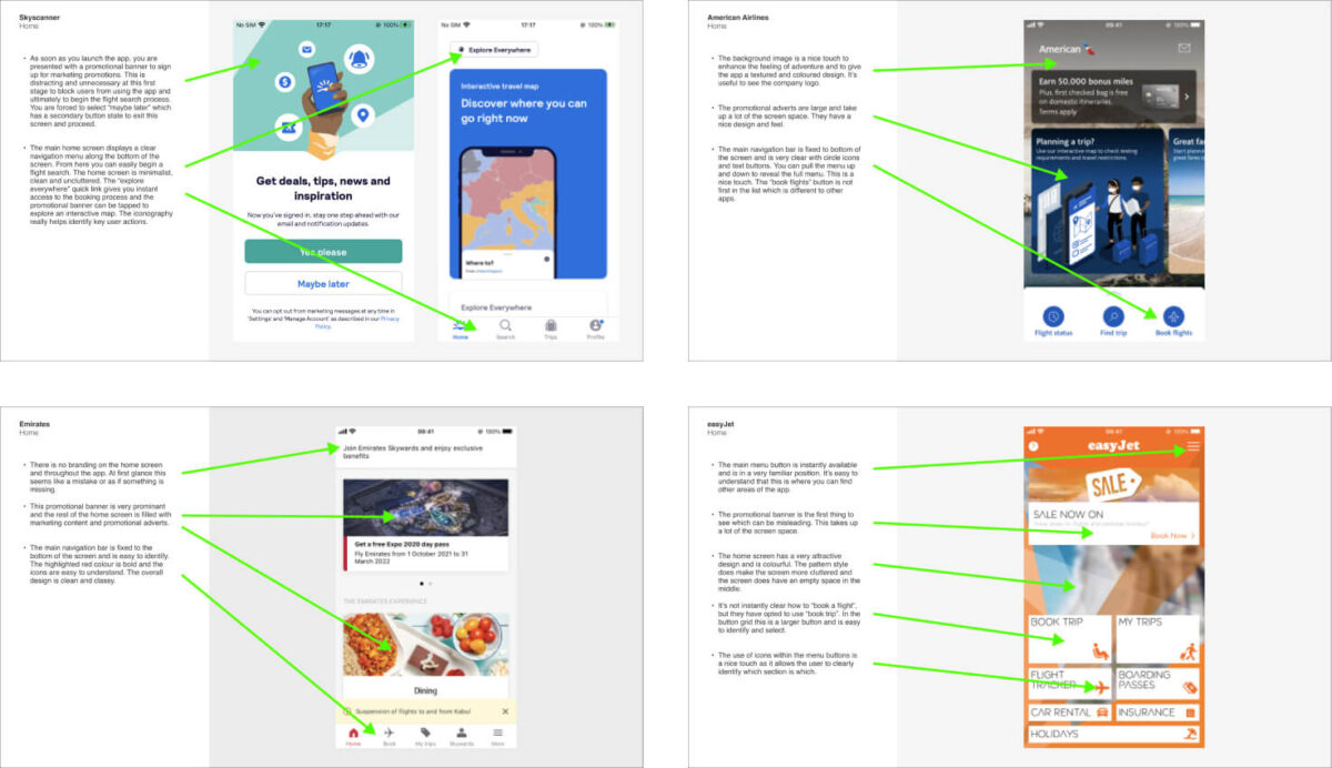
I used this extremely useful research technique to identify what competitors are doing right, and learn from what they are doing wrong. I reviewed four mobile applications to gain some insights on how best to design the Fly UX application.
Firstly, I needed to learn about airline application booking process best-practice, conventions and overall design aesthetics. Understanding the approach of popular airline competitors would give me great insights and knowledge to put into practice.
I identified four best-in-class mobile airline booking applications: SkyScanner, EasyJet, American Airlines and Emirates. I focused on each application’s experience of delivering best practice and conventions that I should emulate and take forward into my product. I critiqued each application by focusing on the home screen, search and select and how users input their details. I made detailed notes and observations by taking screenshots and giving plenty of commentary to explain what’s happening and why I thought it was noteworthy.
Online survey
I created an online survey and emailed it to friends and colleagues to learn more about the goals of airline customers. The data gathered was very useful to make informed design decisions further into the process and it gave me valuable practice analysing survey data.
Firstly, I had to define my research objectives – what am I trying to learn from the survey? I chose Google Forms to create an online survey with 10 questions to gain qualitative and quantitative data. I then distributed the survey via email and LinkedIn to get responses. I had to make sure my respondents had used an airline website or application within the past four weeks and to receive a minimum of 15 responses to get statistically valid data.

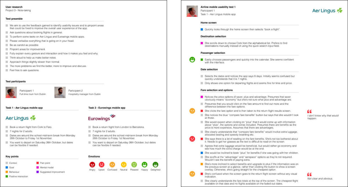
Note-taking
This is a fundamental part of UX research. I highlighted the key insights from observing prerecorded usability test session videos and making detailed notes with highlights.
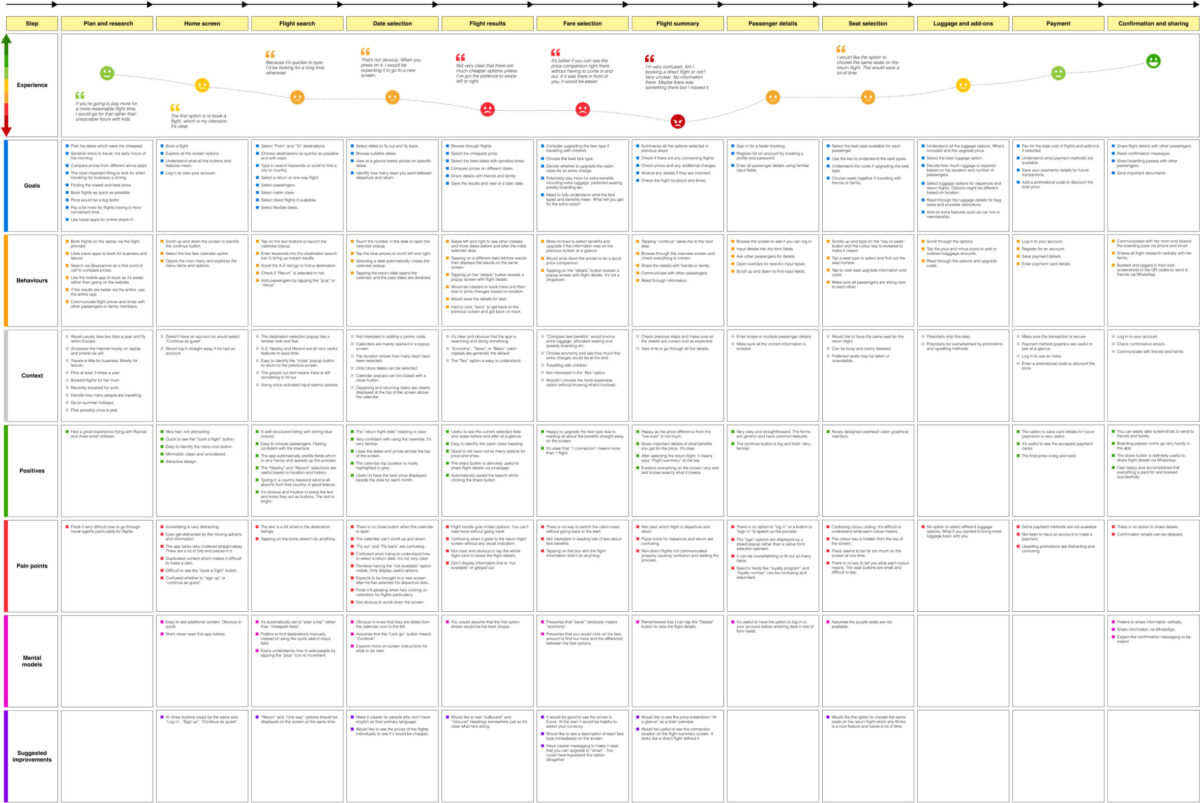
There were two usability test participants and each person had to test a mobile application for two different airline companies, Aer Lingus and Eurowings. Each user was given the test preamble of what to expect from the test structure. I defined the key points to focus on: context, goals, behaviours, positive interactions, pain points, mental models and suggested improvements. Each of these categories were colour coded and highlighted along with my notes. I also defined an emotional scale to emphasise the user’s feeling and emotion throughout the test. These emotions were highlighted along with my notes and key points. I also identified the key sections of each interview and used these as a template for each of the tests. Key quotes from each user were highlighted and featured alongside the notes.
Usability test
Usability testing provided me with deep qualitative insights into the booking experience. I used the usability test sessions to conduct a comparative test where I had the user complete tasks on two different airline applications.
Firstly, I had to create a recruitment screener to help find airline customers from amongst my family, friends and colleagues. I set my recruitment objectives, demographic profiles, user goals and research details to really define the type of users required to gain rich, qualitative insights into the booking experience. I then sent an email to a selection of people to ask if they would be available and willing to participate in my research.
I then created a usability test script with a preamble, a depth interview and test tasks for the user to perform. I then prepared the test environment by recording the mobile phone’s screen, recording audio with a microphone and recording the user’s face using a camera. I selected the RyanAir and British Airways mobile applications to test and created a scenario for the user to follow; where to fly to and from? How many nights to stay? What day to travel on? I then allowed the user to complete various tasks focusing on each stage of the booking process, constantly asking them questions about the experience and how the process made them feel.
During each usability test, I wrote down extensive notes and followed exactly the same structure set out in the note-taking task. The test dialogue was colour coded and quotes were highlighted to show the users feeling and emotions. I watched the usability test video recordings after each session and carefully pinpointed more insights and key points.

Analysis techniques
Defining the problem
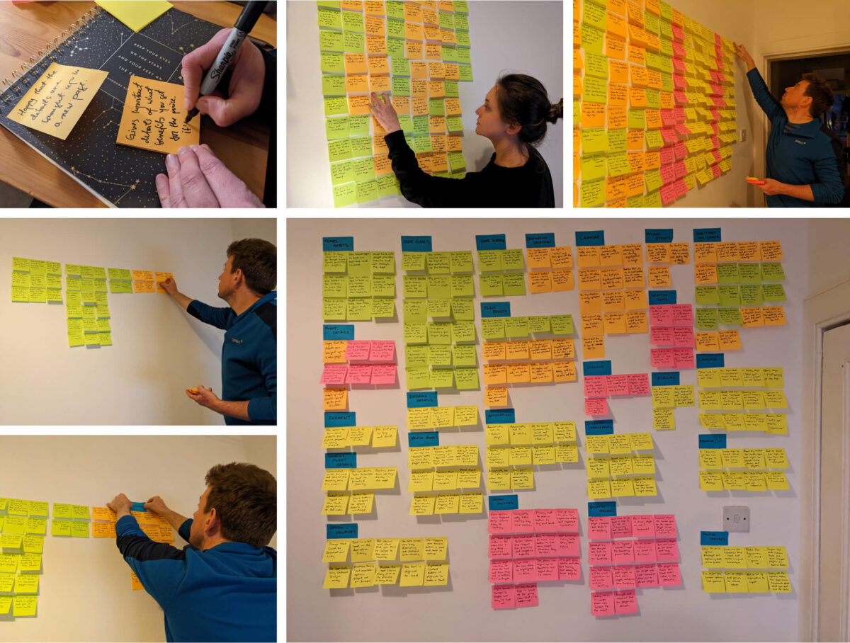
Affinity diagram
Running an Affinity diagram session allowed me to sort through large volumes of data and get to the root of my findings. I reviewed all of the research from my previous tasks and created an affinity diagram to represent what I learned so far and give structure to my qualitative research.
I shared all my research data from previous tasks with my partner. We analysed the competitive benchmarking, online survey, usability test videos and notes and we began to make notes on Post-it notes. We wrote down key points describing the current user experience including goals, behaviours, pain points, mental models and contextual information.
We then started sticking the notes to the wall in a random order just to visualise everything at a glance. Once all the notes were on the wall, we started to categorise the notes into groups. We made a group label and placed the relevant notes under each category title. Large groups were then divided into smaller subgroups to be more specific.
I then created a digital version of the diagram in Figma. I used a key to colour code the notes taken from each research task. I sequenced each group in chronological order, following the user journey and each step in the booking process. I then identified constant experiences throughout the user journey and placed the groups and notes outside of the main sequence. We ended up with quite a few groups and lots of useful notes to take forward into the next task.
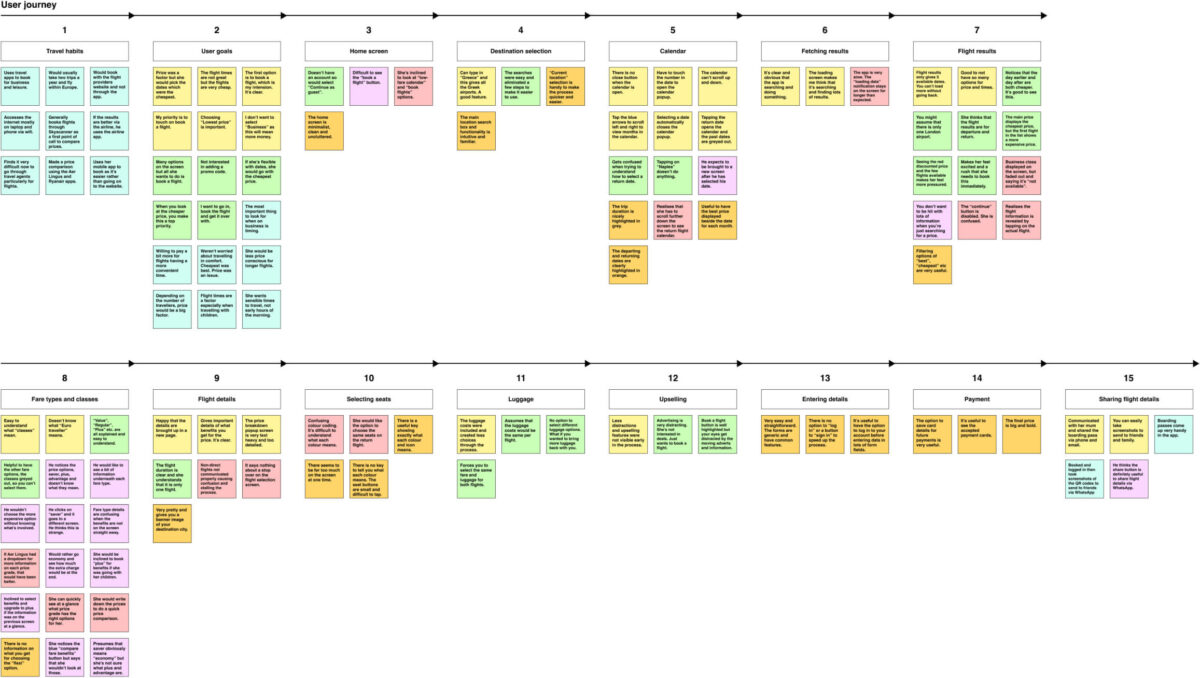
Customer journey map
I built on the work I did in the affinity diagram by putting even more structure on the analysis of the research data. I created a customer journey map to define the high-level steps in the user journey. These steps corresponded to the groupings defined in the affinity diagram.
For each step in the flight booking process, I documented user goals, behaviours, context, positives, pain points, mental models and suggested improvements. These key categories were used to map out the user journey and experience. I also used colour coding again to really enhance the design and make it clear and obvious. I used the same emotional scale from my note-taking task and added in an emotional curve ranging from angry to delighted. I brought the journey map to life with direct user quotes and key points were displayed as bullet points to make it easy to follow.
In the first instance, I sketched out the customer journey map by hand, then I used the rough sketch to structure and design the map even further in Figma.
Design
Solving the problem
Flow diagram
I now had to start designing my mobile application. The main objective was to fix all the issues that were uncovered during my research, which were highlighted in the customer journey map.
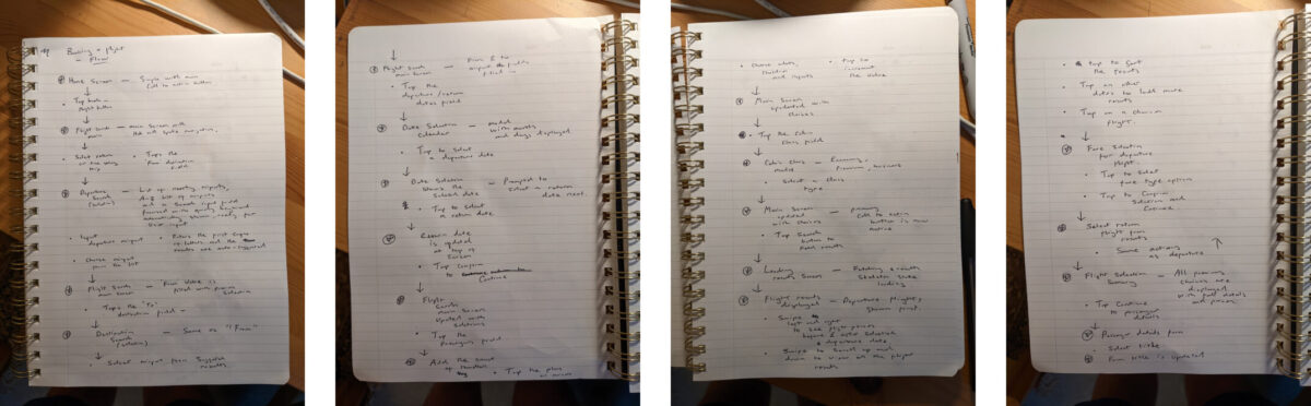
I created a high-level flow for the application and I focused on one flow with one primary use case. I defined all the steps in the booking process and started to identify key screens and states for each part of the user flow.
Firstly, I started sketching out the flow on paper. This was rough and very simple, but it really allowed me to follow the process and break down each user interaction and get a good idea of the different screens involved.
I then took my rough sketches and started to design the user flow in Figma. Each screen or state was represented by a box (a portrait orientated phone screen) and each interaction was represented by a circle (a tap on the phone screen).
Each key section of the flow was highlighted in a specific colour to really make each part of the process stand out. This made the flow diagram easier to follow and understand. My flow was simple and linear from the home screen to the booking confirmation. The diagram gave me the foundations of the application and a solid basis to build on with solid structure and logic.

Interaction design
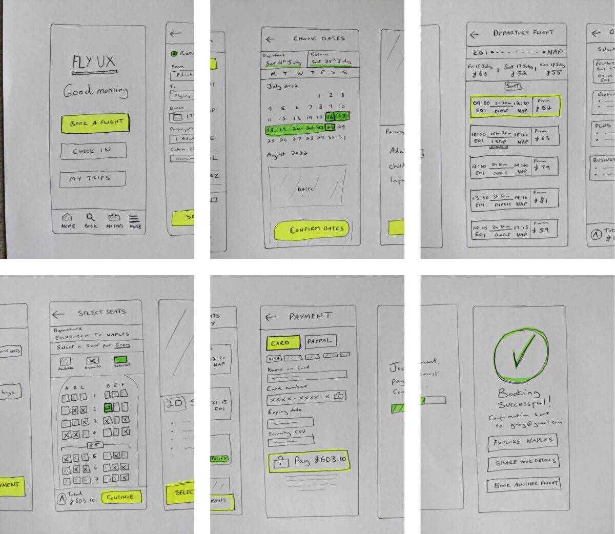
I continued the design process and sketched out all the screens for the mobile application flight booking process. I was now ready to create a solution and start solving the problem.
I went through my flow diagram and defined the different screens to design. I also wanted to include the screen states when the state differs significantly based on user interaction.
I decided to sketch the main screens to complete the flow along with notes and thoughts surrounding any potential issues or inconsistencies. I defined the navigational flow and based on my flow diagram and research, I started to design the application in detail and with a deep understanding of user behaviours.
The flight booking process is linear but it becomes apparent that the main flight search has a hub and spoke navigational flow. The extras screen also has a hub and spoke navigational flow but each selection is optional. I took inspiration from my findings and benchmarking to design an interface which the user can flow through the screens with ease and confidence.
Prototype
Having already defined much of the solution with my flow diagram and sketches, I now had to create a medium fidelity prototype for the Fly UX mobile application with more detail and interactivity. The prototype had to be detailed enough to test the high-level flow, screen layouts, text, and basic interactions.
Closely referring to my flow diagram and sketches, I set out each screen in Figma. Each screen would present each step in the process with each user interaction and screen state. I designed an interface which was simple, minimalist, monochrome and ultimately easy to navigate and understand.
I took each section of the booking process and started to lay out all the different screens containing the necessary user interface components. I built up a library of components and identified common elements to use throughout the application design. I choose a simple typography style and clear, easy to identify buttons and form elements to allow the user to follow their mental model and flow through the screens with ease.
After I had all my screens in place, I went from “design” mode to “prototype” mode in Figma to link all the screens together to build my interactive prototype solution. These links were the user interactions that defined which screen was to show next and what was the screen state. I created a flow, with a starting point, then began to add in the connections with interaction details and animations. I also created overlay screens, skeleton state animation and loading screens to really bring the prototype to life and make it as real and genuine as possible. I really wanted to make the user feel comfortable and confident moving through the prototype screens, without any friction.


Prototype usability test
To really define the extra details that developers need to build the product accurately, I conducted a usability test, including a depth interview using my prototype.
I followed all the steps from my usability test earlier in the user research phase. I created a recruitment screener as a basis for finding airline customers from amongst my family, friends and colleagues. I then created a usability test script with depth interview questions. I prepared the test environment and recorded the session and wrote down detailed notes.
I analysed the usability test session video and notes and started to make improvements to certain areas of the flow. This was extremely useful to continually iterate, develop and shape the prototype into a robust solution.

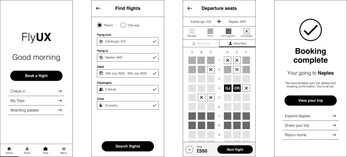
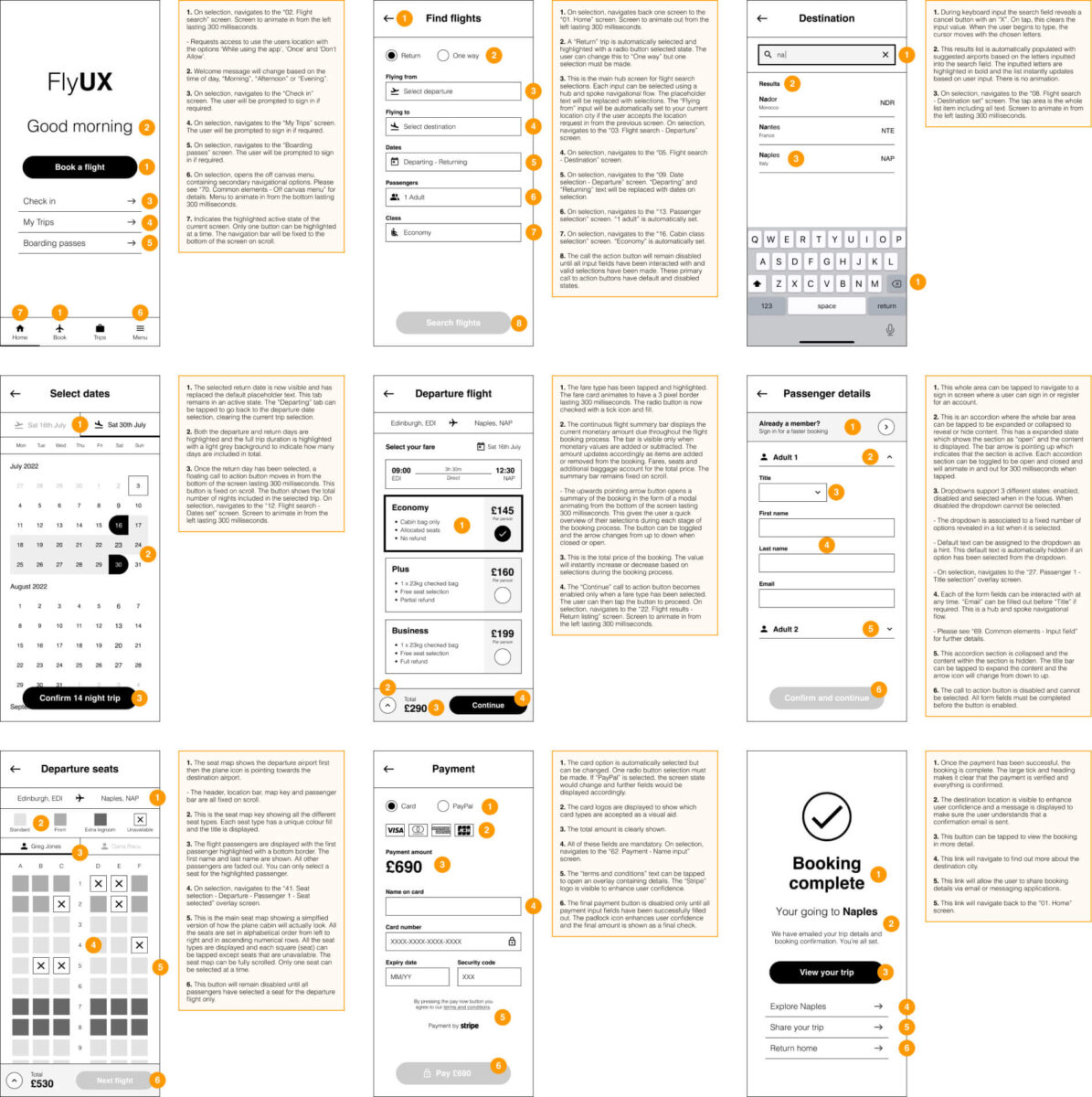
Wireframes
Final design solution
It was now time to take everything from the prototype and create the final design solution. The final blueprints that developers need to build the product accurately.
I captured each screen from the prototype and on each page of the wireframes, placed the screen alongside ordered bullet points describing each action and relevant components. Each screen has a clear title and a creation date. Each bullet point gives details of what will happen when a user interacts with the software.
The animation time and details of screen navigation are communicated clearly in the annotated notes. A developer must understand every aspect of the solution and everything must be described in fine detail. If all the annotations are easy to follow and semantic, the developers can use the wireframes to accurately build the product with confidence and clarity.
Key takeaways
- It’s paramount to follow conventions
- Identify a clear and structured navigational flow
- Minimalistic design is important
- Smart use of typography, UI components and iconography
- Screens follow a user’s mental model and are familiar at a glance
- Flow through the application screens with ease and minimal thought
- Open ended, qualitative questions give rich data and important insights into user behaviours
- Make sure you get enough responses to get statistically valid data
- It’s important to have a balanced mixture of questions to gain qualitative and quantitative data
- Questions must be short and concise to allow people to answer them with ease and confidence
- Take down lots of notes. Be extremely detailed and keep on filtering and iterating
- Key points, emotions and quotes really helped me highlight the main points, organise and structure notes into a format which is easy to follow
- Users want to flow through the booking process with ease
- Introducing extras or promotions too early in the process is distracting and frustrating
- Make controls such as buttons clear and obvious
- It’s important to explain exactly what is happening during each user interaction
- It’s paramount to conduct usability tests to understand users and gain further insights to iterate and improve flows and overall design
Further steps
The next step in the process would be to create a user interface design. My prototype and wireframes are purely monochrome. This is an excellent basis to build on for user interface design. I would create a moodboard, a colour palette, typography style and overall graphical style to really enhance the user experience and make the product more desirable. A simple addition of colour and typography would allow users to engage with the software and feel even more confident.